- Share via
- Share via...
- Recent Changes
- Send via e-Mail
- Permalink
Interface Objects
- Pro Line
- Switch new!
- Thermo Comfort new!
- Comfort HVAC new!
These objects, divided into functions, pages and objects, compose the client application GUI. Please refer to the ”User Interface” section. Each object allows the user to check the system status and control the integrated elements. All these objects shares the following
- Label Name of the object.
- Scale This property allows to adjust object dimensions.
- Rotation This property allows to rotate the object.
- Position This property allows to insert object coordinates in order to place it in the page.
- PIN Protection If enabled, the object is protected and to unlock actions the user must insert a PIN code. For more details refer to Configurator - Protection PINs .
- PIN Code Pin code associated to the object.
- Restrictions This property allows to define whether the object is available for a specific user profile. All objects are visible for all user accounts by default. For more details refer to Configurator - Restrictions .
- View in list If enabled, the object is displayed in the portrait view list on iPad.
- View in web If enabled, the object is displayed on the web interface.
- Mirror This property mirror the image
- Custom images This property allows to select an icon which will represent the object in its different states. By accessing the Collection window, it is possible to select icons from the Thinknx UP collection, or click on Custom Icon set to import other images.
- Biometric Protection This property if enable will require face or fingerprint verification in in order for the user to activate the command.biometric_protection
- Translate This property allow to display different label for the selected object. For more information see Translate Page
- Background visible If enabled displays background for the object and the following properties are displayed:
- color: Permits to choose the color for the background
- opacity: Set the level of opacity for the background image (0 = fully transparent, 100 = fully opaque)
- radius: Radius for the rounded corners of the background (0 = squared corners)
- internal scale: Internal scale of the inner object relative to the dimension of the background
- background size: define the size of the background independently from the actual size of the object
- background border thickness: Thickness of the background border
- background border color: color for the background's border
Hidden This property allows to change the visibility of the objectSkip safety delay Enabling this option allows the button to respond instantly without waiting for user input delay, which helps prevent unintended activations.By right clicking on a selected object, the following items are displayed in the drop-down menu:
- Add object A new system object can be selected from the list.
- Remove object The selected object will be removed from the project.
- Copy Copy the selected object.
- Paste Paste the selected object.
- Paste without suffix paste the selected object without adding suffix to the label
- Select all objects Select all the objects in the page.
- Arrange Arranges objects position. For more details refer to Configurator - Toolbar .
By right clicking on the icons of objects that can be associated with KNX groups, the following items will be active in the drop-down menu:
- Get label from ETS The selected object will be renamed according to the KNX group name previously configured in the ETS project.
- Add text from object label A ”Static text” object with the object label will be automatically added next to the current interface object icon.
- Lock Lock object position.
- Translations display translation for the current object
- New interface group - Create new interface group with the selected interface object. See Group for more information.
Function

Function is a sort of chapter that can collect several graphical pages. Properties can be easily adjusted from the settings window that is displayed on the right side when selecting a function from the list:
- Status Permits to disable the function and to hide it from sidebar.
- Label Name of the function.
- Icon/Graphic Select the desired icon file to be displayed on the left side of the function's label, with a standard resolution of 60×60 pixels.
Page

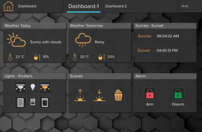
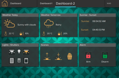
This object is the fundamental element for the User Interface. All the other customized objects forming the project are added on the page element. Each page can have a background color enabled, or a background image selected from the list available inside the software.
- Background visible Enable background option for the page.
- Background color Select the color for the background.
- Background image enabled Enable background image.
- Background image fill mode Select the filling mode for the background. Options available: Pad, Preserve aspect and crop, Preserve aspect and fit, Stretch, Tile.
- Background image selected Choose the background from an embedded background list.
- Background image opacity Change the opacity of the background (0=fully transparent , 100=fully opaque).
- Use custom background Enable custom background
- Background Image This property allows to select an icon which will represent the object in its different states. By accessing the Collection window, it is possible to select icons from the Thinknx UP collection, or click on Custom Icon set to import other images.
Popup

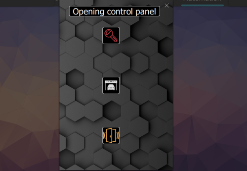
This object allows the user to create a popup instead of a page. Similar to a page, a popup can contain the majority of the User Interface objects. The popup can be designed with a different background, and can be recalled from a Generic Button or from a trigger inside the logic Module.
Example of a Popup
- Width Specify the width of the popup window..
- Height Specify the height of the popup window..
- Show Close Button When enabled, displays an X button on the top right corner to close the popup. If disabled, user will need to click outside the popup to close it.
- Inactivity timer status This property allows to set a timer for automatic closing
- Timeout Popup will be automatically closed when timing set expired,expressed in seconds
- Background visible Enable background option for the page.
- Background color Select the color for the background.
- Background image enabled Enable background image.
- Background image fill mode Select the filling mode for the background. Options available: Pad, Preserve aspect and crop, Preserve aspect and fit, Stretch, Tile.
- Background image selected Choose the background from an embedded background list.
- Background image opacity Change the opacity of the background (0=fully transparent , 100=fully opaque).
- Use custom background Enable custom background
- Background Image This property allows to select an icon which will represent the object in its different states. By accessing the Collection window, it is possible to select icons from the Thinknx UP collection, or click on Custom Icon set to import other images.
Open a popup from a Generic Command
- Add the popup and design its content.
- Once finished, add a Generic Button to the desired page and access the commands window.
- Select the command “Show Popup: CLIENT SPECIFIC” and select the previously created popup.
Open a popup from the Logic Module
- Add the popup and design its content.
- Go to System tab and create a new Logic Module sheet.
- Construct the logic that will trigger the popup.
- For the logic output, add the block “Command” in the Outputs category.
- Select the command “Show Popup: ALL CLIENTS” and select the previously created popup.
Group
link
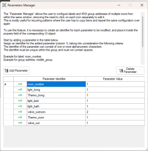
This object groups interface objects together, encloses them in a menu, and allows for individual or group management. In the case of a group, it enables parameter management through an interface window, useful for a series of identical hotel rooms for example.
Example of tree view
- Name name of the group
- Group Parameters Displays and allows managing the parameters of the associated UI group opening the Parameter Manager
- Parameter Manager The “Parameter Manager” simplifies the configuration process for multiple icons by allowing users to configure labels and KNX group addresses within a single window. Users can add parameters with unique identifiers, assign values to them, and then apply these identifiers to icons on the user interface. This streamlines repetitive tasks and ensures consistency across multiple icons. Users simply need to enclose the identifier within curly brackets {} when specifying labels or group addresses for icons.
- Run Time View When enabled all parameters inside object's KNX or string properties will be displayed using their clear value, otherwise as parameter's key.
When Runtime View is enabled, parameterizable proprieties are read only
Picture

This object allows to import a (PNG or JPG) image file in the project. (It can be used for example as interface background).
- File Image file to select.
- Opacity Change the opacity of the Picture (0=fully transparent , 100=fully opaque).
- Scale This property allows to adjust object dimensions
Static text

This object allows to insert text labels in the GUI.
Example of texts
- Text dimension Size of the font used for the text
- Text color Specifies the color of the text
- Multiline When enabled, if the text exceeds the maximum width, it will wrap onto multiple lines.
If the property ”Multiline” is set to ”Enabled”, the following properties will appear:- Max. width: Maximum width of the text field if multiline is enabled.
- Text alignment: Text alignment
Switch

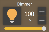
This object is used for every kind of switching command: toggle, dimming, ”send 1”, ”send 0”, ”send 1 on press and 0 on release”, etc. If linked to a ”Switch schedule” object, this object can be used with a timer.
Example of switches
- Switching type This property indicates the way the command is sent; the following options will be displayed in the list:
- Dimmer: if this option is selected, a lighting percentage based on a value set by the user is sent to the system. (0 stands for ”turned off”, 255 stands for ”100% turned on”).
- OFF on pression: 0 is sent on pression, anything on release.
- OFF on pression, ON on release: 0 is sent on pression, 1 on release.
- ON on pression: 1 is sent on pression, anything on release.
- ON on pression, OFF on release: 1 is sent on pression, anything on release.
- ON/OFF norm. closed: 0 is sent for ON, 1 for OFF.
- ON/OFF norm. opened: 1 is sent for ON, 0 for OFF.
- Value on pression: a value predetermined by the user is sent on pression. (1byte)
- Value on pression and on release: a value predetermined by the user is sent on pression and on release. (1byte)
- Value on release: a value predetermined by the user is sent on release.(1byte)
Bus type twelve different options are displayed (KNX, Lutron, Modbus, MyHome, Philips Hue, ZWave,DuoTecno,Ethernet Gateway,MQTT,Philio Gateway,Zade)Graphic This property allows to select an icon which will represent the object in its different states. In addition to some standard graphics, it is possible to use a custom graphic by selecting the ”Custom” option.
If the ”Custom” option is selected, the following properties will be displayed:- File for off: Image displayed for ”Off” switch status.
- File for on: Image displayed for ”On” switch status.
- File for dimmed: Image displayed for ”Dimmed” switch status.
For every Graphic option selected it is possible to have a preview by editing the following property:
Visualisation This property allows to have a graphic preview of the object for each of its states (dimmed, on or off).
If the Switching type option is ”Value on pression”, ”Value on release” or ”Value on pression and on release”, the following properties are displayed:- Value sent to the KNX group on press (1byte).
- Value sent to the KNX group on release (1byte).
For all the kinds of switching types, a scheduling feature is available:
Use pop-up If enabled, this property allows the user to interact with the system using a pop-up displayed on the client application.Long Press if enabled, on a long press on the button it will allows the user to interact with the system using a pop-up displayed on the client applicationTime schedule If enabled, the object can be temporised using a system object.
If ”Time schedule” is ”Enabled”, the following properties will appear:- Automatic switching off after a timeout -
- Specific time switching/dimming -
- Specific time switching/dimming and automatic off
Depending on the type of Bus selected in the parameter “Bus Type”, different parameters will be visible to configure the ON/OFF control and feedback of the object:
- ON/OFF group KNX group which the value is sent to.
- ON/OFF group feedback KNX group that allows to read the value.
- Value group KNX group which the value set by the user that will is sent to; if the ”Dimmer” option is selected, the light will be regulated according to this value.
- Value feedback group KNX group that provides the feedback of the value set by the user.
- Modbus gateway select the Modbus gateway created and configured in the System section.
- ON/OFF datapoint Modbus datapoint which the value is sent to.
- ON/OFF feedback datapoint Modbus datapoint that allows to read the value.
- Value set datapoint Modbus datapoint which the value set by the user that will is sent to; if the ”Dimmer” option is selected, the light will be regulated according to this value.
- Value feedback datapoint Value feedback datapoint.
- Gateway Lutron Select the Lutron gateway created and configured in the System section.
- Lutron output Access the list of elements available for the current System object.
- Hue gateway Select the Hue gateway created and configured in the System section.
- Hue element Access the list of elements available for the current System object.
- Gateway MyHome Select the MyHome gateway created and configured in the System section.
- Lights MyHome Access the list of elements available for the current System object.
- Gateway DuoTecno Select the DuoTecno gateway created and configured in the System section.
- DuoTecno Light Access the list of elements available for the current System object.
If Ethernet Gateway is selected
- Ethernet Gateway Select the Ethernet gateway created and configured in the System section.
- Virtual Input Access the list of virtual inputs available for the current System object.
- Virtual Output Access the list of virtual outputs available for the current System object.
- MQTT Gateway Select the MQTT gateway created and configured in the System section.
- MQTT Feedback (Subscriber) Access the list of MQTT subscribers available for the current System object.
- MQTT Command (Publisher) Access the list of MQTT publishers available for the current System object.
- ZWave Controller Select the Zwave controller created and configured in the System section
- ZWave Node Access the list of virtual inputs available for the current System object.
- ZWave Instance Access the list of virtual outputs available for the current System object
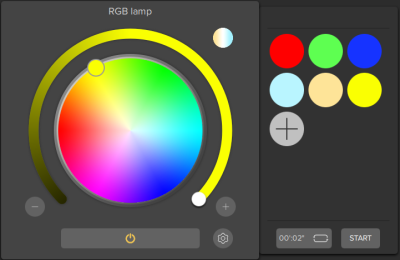
RGB Lamp

This object allows the user to control an RGB or RGBW or Tunable White lamp from the application. With the possibility of creating color cycles of choice, also choosing the dimming time.
Example of a RGBW Lamp
- RGB object RGB system object previously integrated into the system that will be associated to the current interface object. For more details refer to System objects - RGB.
- Supported mode Color mode used with the icon. The user can choose between “RGB” (color wheel only visible), “Tunable White” (no color wheel, just a spectrum to change the light temperature), and “RGB + Tunable White” (possibility to toggle between color wheel and temperature spectrum).
- Visualization This property allows to visualize a preview of the object for each of possible status. (ON or OFF)
- Custom images This property allows to select the icon correspondent to this object. If the ”Custom option” is selected, the ”Off image” and ”On image” properties will be displayed:
- OFF image: Image displayed for ”Off” RGB status.
- ON image: Image displayed for ”On” RGB status.
Thermo Comfort

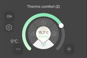
Chronotermostat object that allows the user to set hourly, daily and weekly temperatures and boiler programs. It reads the current temperature and gives the feedback of heating and cooling valve.
- Bus type seven different options are displayed (KNX, Modbus, MyHome, ZWave,DuoTecno,Zade, Tiemme)
- Use extended UI This property allows to select the functioning mode of the plant: if disabled, the user can either manually set the temperature using a pop-up displayed on the client application or use temporisations created using the chronotermostat. If enabled, the user can set the temperature using the predefined programs (comfort, standby, night, chrono).
- Show season protection If enabled, it will show the button to toggle season protection modality (To enable or disable the thermostat) To work properly, the modality command and status groups should be populated
- Use chronotermostat This property allows to enable or disable the usage of chronotermostat function.
The related ”Chronotermostat” system object has to be configured with the same functioning logic. ”Use extended UI” disabled → ”Temperature mode” enabled. ”Use extended UI” enabled → ”Temperature mode” disabled.
- Create chart If Enabled will show a chart plotting temperatures and valve position
- Chronotermostat object Chronotermostat system object previously integrated into the system that will be associated to the current interface object. Please refer to the dedicated part on System - Chronothermostat.
- Create chart Show a chart plotting temperatures and valve position
if Show season protection is enabled, the following proprieties will be displayed
- Mode Group KNX Group to control modality (1byte)
- Mode Value Standard If enabled the KNX standard will be followed (DPT 20.102) otherwise custom values can be use to command modality
- Status Group KNX group that gives feedback about device status (1byte)
- Status value type It defines the meaning of values received from status byte group
Depending on the type of Bus selected in the parameter “Bus Type”, different parameters will be visible to configure
- Actual temperature group KNX group related to the actual temperature value. (2byte-float).
- FB setpoint temperature group KNX group which the temperature value set on the thermostat by the user is sent to.
- Setpoint type Choose between Absolute,Base + Relative (DPT9) or Base + Relative (DTP6)
- If “Setpoint type” is set to Absolute
- Slider Step step magnitude for setpoint slider
- Setpoint temperature group KNX group to write for changing setpoint temperature ( if no group is inserted in FB setpoint temp group. this group is also read to know the actual setpoint )
- Setpoint feedback group KNX group that give feedback about current setpoint temperature (2 byte)
- Use custom setpoint range If enabled it permits to choose personalized interval for setpoint temperature values
If “Setpoint type” is set to Base + Relative(DPT9)- Slider Step step magnitude for setpoint slider
- Setpoint base default Base setpoint value to use as default if the thermostat will not reply to read at the base setpoint KNX group
- Setpoint feedback group KNX group that give feedback about current setpoint temperature (2 byte)
- Setpoint base feedback group KNX group that give feedback about setpoint base value(2 byte)
- Setpoint shift group KNX group used to shift the base setpoint and obtain the desired setpoint temperature.
- Use custom setpoint range If enabled it permits to choose personalized interval for setpoint temperature values
If “Setpoint type” is set to Base + Relative(DPT6)- Slider Step step magnitude for setpoint slider
- Setpoint base default Base setpoint value to use as default if the thermostat will not reply to read at the base setpoint KNX group
- Setpoint feedback group KNX group that give feedback about current setpoint temperature (2 byte)
- Setpoint base feedback group KNX group that give feedback about setpoint base value(2 byte)
- Setpoint shift group KNX group used to shift the base setpoint and obtain the desired setpoint temperature.
- Setpoint shift step magnitude The value represent the step magnitude used during setpoint temperature shifting. It must be the same as the one set in the temperature controller
- Use custom setpoint range If enabled it permits to choose personalized interval for setpoint temperature values
Group for cooling KNX group related to the cooling valve.Group for heating KNX group related to the heating valve.Heating/Cooling group KNX group that give feedback about Heating or cooling mode (0 = Cooling / 1 = Heating)- Fan control If enabled the object controls also the fan speed and new properties will be displayed
- Fan mode group KNX group related to control fan working mode(0=auto, 1= manual)
- Fan mode Feedback group KNX group related to the actual fan mode
- Fan mode inverted Invert the meaning of the mode group value (If enabled 1= Auto)
- Fan speed OFF status If disabled the off status will not be used on the Thinknx Application, the level 0 will be the first status used for command otherwise if it is enabled the Level 0 fan status will be the OFF command.
Fan speed data type- Status name name that will appear on the application for the fan statuses * If DPT 1 is selected
- Fan speed levels the fan speed is controlled with different KNX group for each speed
If DPT 5 is selected- Fan speed command group KNX group related to control fan speed (1 Byte - DPT 5)
- Fan speed status KNX group related to the fan speed status
- Fan speed levels the fan speed is controlled with 1 byte unsigned KNX group
- Modbus gateway select the Modbus gateway created and configured in the System section.
- Actual temperature datapoint Modbus datapoint related to the actual temperature value.
- Setpoint temperature datapoint Modbus datapoint which the temperature value set on the thermostat by the user is sent to.
- Setpoint temperature feedback datapoint Modbus datapoint that allows to read the value.
- Cooling datapoint Modbus datapoint related to the cooling valve.
- Heating datapoint Modbus datapoint related to the heating valve.
- Status datapoint Modbus datapoint related to the status of the device
- Value for Comfort Value to send to mode group to change into Comfort state
- Value for Standby Value to send to mode group to change into Standby
- Value for Night Value to send to mode group to change into Night
- Value for Frost-protection Value to send to mode group to change into Frost-protection
- FB Value for Comfort Feedback Value received into status group that rapresent Comfort state
- FB Value for Standby Feedback Value received into status group that rapresent Standby state
- FB Value for Night Feedback Value received into status group that rapresent Night state
- FB Value for Frost-protection Feedback Value received into status group that rapresent Frost-protection state
- TIEMME gateway Select the TIEMME gateway created and configured in the System section.
- Tiemme device TIEMME device preset in the correspondent system object properties.
- MyHome gateway Select the MyHome gateway created and configured in the System section.
- MyHome zone MyHome device preset in the correspondent system object properties.
- gateway Zade Select the Zade gateway created and configured in the System section.
- zadeHVAC Zade device preset in the correspondent system object properties.
- ZWave controller Select the ZWave gateway created and configured in the System section.
- ZWave node The ZWave node inside the selected controller to control with this object.
- ZWave status The Zwave instance in the selected node to visualize the on/off status.
- ZWave setpoint temp. The ZWave instance inside the selected node to control setpoint temperature with this object.
- ZWave actual temp. The ZWave instance inside the selected node to visualize setpoint temperature with this object..
- ZWave mode The ZWave instance inside the selected node to control the operating mode with this object.
- gateway DuoTecno Select the DuoTecno gateway created and configured in the System section.
- DuoTecno Sensor DuoTecno device preset in the correspondent system object properties.
For more information about the user experience I refer you to the user guide for the climate.
Comfort HVAC

This object allows to control an air conditioning device integrated into the system, set temperature, set mode, set ventilation and receive feedback from the machine.
Example of a HVAC configured controller
- HVAC controller HVAC controller system object previously integrated into the system that will be associated to the current interface object. Please refer to the dedicated section in System - HVAC Controller .
- HVAC device HVAC controller device previously integrated into the system that will be associated to the current interface object.
- Supported Mode Choose the modes in the graphical interface that the user can manage, with a minimum of two modes required
- Setpoint temp.. min. minimum value for the selectable setpoint temperature
- Setpoint temp.. max. maximum value for the selectable setpoint temperature
- Setpoint temp. step Step size for selectable setpoint temperature
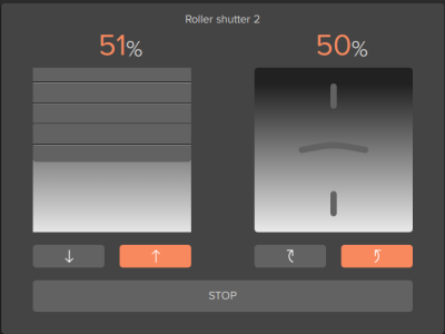
Roller shutter

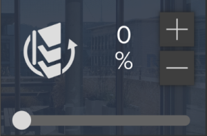
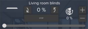
This object allows the user to control rollers with different type of movement like Up/Down, Left/Right and rotations.
It is highly recommended to correctly plug in the cables in the actuator in order to avoid the need to set the inverted functioning.
- Visualization This property allows to visualize a preview of the object for each of possible status. (Open, close, or half).
- Custom images This property allows to select the icon correspondent to this object. If the ”Custom option” is selected, the ”Image for close”, ”Image for open” and ”Image for half” properties will be displayed:
- Image for close: Image displayed for ”Close” roller status.
- Image for open: Image displayed for ”Open” roller status.
- Image for half: Image displayed for ”Half” roller status.
Bus type seven different options are displayed (KNX, Lutron, MyHome, ZWave,DuoTecno,Zade,Velux)Movement Type Type of movement to control the shutter. Possible options:- Up/Down
- Left/Right
- Up/Down + Rotation
- Rotation
Absolute Positioning Enable/disable the absolute positioning of the roller shutter using the 1byte value group.Rotation Rotation range of the roller shutter, if applicable. Available options are 0-180 degrees, or 0-90 degrees.Inverted functioning If enabled, rollers will be activated inversely.Send value Choose between “Only on release” or “ On changing position and on release”Depending on the type of Bus selected in the parameter “Bus Type”, different parameters will be visible to configure
- Move group KNX group that controls the rollers movement. If value 1 is sent, the roller is open, if value 0 is sent, the roller is closed.
- Stop group KNX group that controls the rollers stopping. If value 1 is sent, the roller is stopped, if value 0 is sent, the roller starts to move again.
- Value group (only visible if Absolute Positioning is enabled): KNX group that controls the position of rollers; this value represents the opening percentage.
- Value feedback group (only visible if Absolute Positioning is enabled): KNX group that reads the value related to the position of rollers (1byte).
- Gateway DuoTecno Select the DuoTecno gateway created and configured in the System section.
- DuoTecno Motor DuoTecno device preset in the correspondent system object properties.
- Lutron gateway Select the Lutron gateway created and configured in the System section.
- Lutron Output Lutron output preset in the correspondent system object properties.
- Gateway MyHome Select the MyHome gateway created and configured in the System section.
- Roller MyHome MyHome device preset in the correspondent system object properties.
- Velux Gateway Select the Velux gateway created and configured in the System section.
- Velux Element Velux device preset in the correspondent system object properties.
- ZWave controller Select the ZWave gateway created and configured in the System section.
- ZWave node The ZWave node inside the selected controller to control with this object.
- ZWave instance The Zwave instance in the selected node to control with this object.
- Gateway Zade Select the Zade gateway created and configured in the System section.
- Zade Scene Zade scene associated in the correspondent system object properties.
Analog value

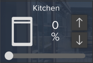
This object allows to visualize a value read from KNX or from any other source in the GUI. The object permits also to set a value using a slider if this functionality is correctly set up.
- Visualization Four possible option are selectable (Numbers, Bar,Circle,Slider with +/- buttons).
- Send value If enabled, the analog value can be set and will be displayed on the client application. If “Send value” is enabled, also the property “Step for slider” will appear:
- Step for slider Indicates the numeric step needed to increment or decrement the value on the slider.
- Max value If the value is higher than the preset one, the latter will be always be displayed on client application. It is particularly useful for a better functioning of the graphical visualization.
- Min value If the value is lower than the preset one, the latter will be always be displayed on client application.
- Value Value preview on the GUI.
- Factor The read value will be converted according to this factor in order to be expressed with the desired measurement unit.
- Data source Source of displayed data (KNX, Modbus, System Object, Zwave).
If visualization type is set to Slider
- Show name label allows to show the Label value on the object.
- Show value label allows to show the datapoint value on the object.
- Colors of levels allows to configure the different colors for each value interval.
- Show buttons +/- displays or hides the slider buttons to increase or decrease the value.
- Button size defines the size of +/- buttons.
- Buttons background opacity sets background opacity for +/- buttons.
- Buttons background color sets background color for +/- buttons.
- buttons foreground color sets foreground color for +/- buttons.
- Grip color defines color for the slider grip.
- Cursor shape it allows you to change the shape of the cursor between round or rectangular
- Track Height sets a custom height for the slider track
- Show ruler it allows you to draw a configurable ruler on the slider
- Ruler color set color for the ruler
- Major tick frequency set the frequency of major tick drawn on ruler
- Minor tick frequency set the frequency of minor tick drawn on ruler between major ticks
If visualization type is set to Numbers
- Custom Images it allows to choose the custom images to associate to the object on Portrait mode
- Value analog text alignment allows for the alignment of the current value inside the space reserved for showing text
- Unit of measure Unit of measure string to be written after the value as unit of measure symbols.
- Decimal digits Number of decimal digits to display.
- Sign Enable or disable the sign before digits.
- Font size Specifies the size of the text defined in the “Text” property
- color text Specifies the color of the text
If visualization type is set to Bar
- Show name label allows to show the Label value on the object.
- Show value label allows to show the datapoint value on the object.
- Unit of measure string to be write after the value as unit of measure symbols
- Colors of levels allows to define the color ranges for the bar. Values are in percentage of bar length (0 - 100%)
If visualization type is set to Circle
- Show name label allows to show the Label value on the object.
- Show value label allows to show the datapoint value on the object.
- Value analog text alignment it allows to align of current value inside the space reserved for showing text
- Unit of measure string to be write after the value as unit of measure symbols
- Decimal digits number of decimal digits to display
- Sign Enable or disable the sign before digits
- Font size Specifies the size of the text defined in the “Text” property
- color text Specifies the color of the text
- Colors of levels allows to define the color ranges for the bar. Values are in percentage on bar lenght(0 - 100 %)
- Circle thickness It allows changing the thickness of the colored part of the circle representing the actual value
- Start angle Angle at which the circle starts rapresenting the minimum allowed value. Angles are in degrees measured in clocwise direction starting from 6:30 time
- End angle Angle at which the circle ends rapresenting the maximum allowed value. Angles are in degrees measured in clocwise direction starting from 6:30 time
- Track color Color of the track underlying the circle
- Track thickness Thickness of the track underlying the circle
- Symmetric Range If enabled, values will be represented starting from the middle circle.
- Rounded Line If enabled, the circle and the track line will be terminated using a rounded linecap instead of a straight one. This option is available only when the total circle angle is less than 360°
If the Data Source property is set to KNX
- KNX data type Type of KNX data to read from the bus.
- Value group KNX group used to read the value.
- Value send group KNX group used to send the value by pop-up.
If the Data Source property is set to Modbus
- Modbus gateway Modbus gateway previously configured in System objects.
- Value datapoint Modbus datapoint used to read the value.
If the Data Source property is set to Zwave
- ZWave controller Select the ZWave gateway created and configured in the System section.
- ZWave node The ZWave node inside the selected controller to control with this object.
- ZWave instance The Zwave instance in the selected node to control with this object.
- Send value to ZWave If enabled, it will be possibile to send values to ZWave node using a pop-up and more parameters will show
- ZWave node for sending The ZWave node inside the selected controller to send with this object.
- ZWave instance for sending The ZWave instanec inside the selected node to send value with this object.
If the Data Source property is set to System Object
- System status Status of a system object to use as data source, for example sonos volume value,home theater video type, power status, active input.
- Command Command to send when the value is changed by the user. Use percentual value inside the value that you want to replace with the slider value.
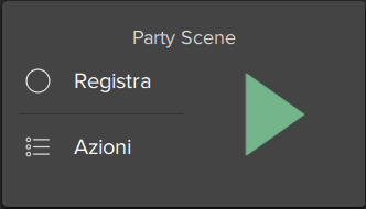
Scene

This object allows the user to launch, set or record a scene directly from the client interface.
- Scenary object A system object previously integrated into the system that will be associated with the current interface object. Please refer to the dedicated part in System .
- Force configurator name If enabled, it will always display the name of the configurator, and the user will not be able to change it from the graphical interface.
- Text position allows to choose the text position relative to the object icon.
For more information about user experience I refer you to the user guide for the scene
Intercom

This object allows the user to answer the intercom from client application.
Example of the intercom object
- KNX ring group KNX group that sends a telegram when an incoming call from an identified caller is detected.
- KNX close group KNX group that sends a telegram when a call received by client devices has to be stopped.
- System PBX
- If disabled, the system works with an external PBX and the ”Caller ID” property will be displayed:
- Caller ID: Doorstation extension needed to answer incoming calls; if no caller ID is inserted, the user will not be able to answer any call.
If enabled, the ”PBX intercom device” property will be displayed:- PBX intercom device: A PBX intercom device system object previously integrated into the system that will be associated with the current interface object.
If you do not know the Caller ID of the door station, you can retrieve it: leave the Called ID field blank, enter the data for registration and upload the project on iPad or iPhone. With the project open on the iOS client, close the app and make the call from the door station. The extension number of the door station will be displayed in the notification of the iOS client.
For more information about user experience I refer you to the user guide for the intercom panel.
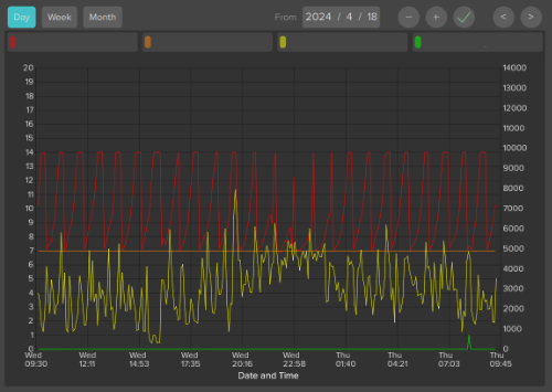
Chart

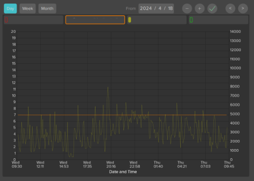
This object allows to display in the client interface the data stored in the Cloud database previously configured in the chart.
To work properly this object requires an active internet connection and the ThinKnx Cloud enabled and configured!
- Color theme Combinations of colors used to draw the chart.
- Show legend If enabled, the legend of the chart will be shown, and the following two properties will be displayed
- Overlay legend
- If enabled, the legend will be placed inside the chart area
- If disabled, the legend will be placed outside the chart. This option is only valid for iOS clients
- In either case, there is the ability to enable and disable the display of the series by the user through tapping on the description, but this functionality doesn't work in column charts and is currently only available for iOS clients.
Legend position Position of the legend relative to the chart. This option is only valid for iOS clientsX axis List of X axis of the chart (only one available).X axis List of X axis of the chart (only one available).Y axis List of Y axis of the chart.Series List of the series of data displayed in the chart.Navigation bar- When enabled, the time interval can be selected.
- When disabled, the chart will show a fixed time interval regarding the last data recorded. In this case, the following property will be displayed:
- Timespan Duration of data to show. Choose from predefined options such as Last Day, Last Week, Last Month, or Last Year. The chart will always start with the present moment on the left
The chart supports only one X axis. To edit its properties, click the button on the right of the X axis property:
- Label Name assigned to the X axis.
- Show label If enabled, the name of the axis will be displayed in the chart.
- Show grids If enabled, grid lines will be displayed for the axis.
By default, one Y axis is already created in the chart, but it is possible to add a second Y axis to differentiate the scales of the values displayed. To configure a Y axis, click on the button on the right of the Y axis property. In the widows that appears, click ”Add” to add a new axis and select it to edit its properties:
- Label Name assigned to the Y axis.
- Show label If enabled, the name of the axis will be displayed in the chart.
- Show grids If enabled, grid lines will be displayed for the axis.
- Axis position Specifies whether the axis will be drawn on the left or right of the plot.
- Custom axis range If enabled, the values range of the axis will be predefined. If disabled, it will be calculated automatically so that it comprehends the whole data range.
If the Custom range property is enabled, the following properties will be displayed:- Minimum Y: Value displayed in the lower edge of the Y axis.
- Maximum Y: Value displayed in the upper edge of the Y axis.
- Step: Value between two ticks on the Y axis
Each chart series represents a system Database variable. To add a series, click on the button on the right of the Series property. In the window that appears, click on ”Add” and adjust the properties of the new object:
- Label Name assigned to the series that will be displayed in the legend.
- Reference axis Y axis which the series refers to.
- Series type Type of graphical representation of the series in the plot (Point, Line or Column).
- Color Color of the line/point/column in the chart.
- Line width Line thickness of the line/point/column in the chart.
- Database Database system object which contains the variable to plot.
- Variable Database variable used to plot the data.
Weather

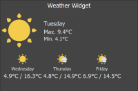
This object allows to add the weekly weather forecast to the project.
To work properly this object requires an active internet connection because the data are downloaded from an external server!
Example of the Weather of Milan
- City/Code The system will detect weather conditions of the selected city.
Web Browser

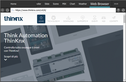
This object allows to add a web browser inside a project page, allowing the user to access web pages using one single application.
Note that URLs with HTTPS used for secure communication are not yet available for the Web Browser object, and that there are some navigation limitations due to the inavailability of certain plugins.
Example of a web page
- URL URL that will be loaded in the browser, example: http://www.google.com.
- Show fullscreen if enabled, browser will show in fullscreen. The size will adapt to the screen's size and resolution.
Irrigation panel

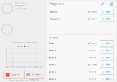
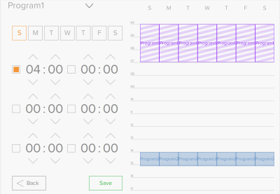
This object is a dashboard used by the user in the client application to manage the Irrigation system object. It allows the user to independently set up zone programs and manage daily start times through the calendar.
Example of a irrigation panel calendar program
- Irrigation object Irrigation object defined in the system object, that will be associated to the current interface object. For more information on how to set up times and calendar, I refer you to the user guide for the irrigation panel.
Generic command

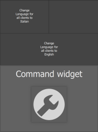
This generic button can be configured in order to perform a specific action (f.e: send telegrams on bus, launch a scene,show a popup, send a push notification,change function and page). It can be programmed to control each server service.
Example of generic commands
- Command Type of command to be related to this button. For more information about the type of command see object command and Internal service
- Text dimension Font dimension.
- Text color Specifies the color of the text
- Extra text Customisable text.
Extended command

This object is a particular button that, reading a value from KNX or a different data source, can switch between different states defined by the user. States can be represented by different images or strings. Depending on the data type of the source, strings for the states can also come directly from the source (for instance it is possible to show text coming from KNX or date and time). For each state it is possible to associate two actions, one for press and one for long press event. With this object it is possible to create very complex interaction elements like gauges, dynamic texts etc.
Example of Extended command
- Type Graphical type of the object:
- Graphic: Object’s states are represented by images.
- Text: Object’s states are represented by text defined by the user for each state or coming directly from KNX.
- Text Alignment This property allows users to specify the alignment of text-based states. Options include Left, Right, and Center alignment, providing flexibility in how the text is displayed within the object.
Feedback States List of object’s states defined by the user.Visualization This property allows to visualize a preview of the object for each of possible status.Skip safety delay Enabling this option allows the button to respond instantly without waiting for user input delay, which helps prevent unintended activations.To enable the background feature on states, you must first enable it in the general parameters. Then you can decide when adding the states in which to enable it and how
If the Data Source property is set to System Object
- System status Status of a system object to use as data source, for example sonos volume value.
If the Data source property is set to KNX
- KNX Data Type Type of data read from KNX bus.
- KNX group KNX group of the data to read.
To define Extended Command’s states, follow these steps:
- Click on the button displayed on the right of the “Feedback States” property to open the states editor window.
- Click on “Add” to create a new state, and adjust its properties in the grid.
For each state, you can define two actions: one for a press and one for a long press:
- Command This is the system command to perform when the object is pressed
- Hold press function If enabled, the hold press function is activated for the object, and the following property is displayed:
- Command hold This is the system command to perform when the object is long pressed.
If Type property is set to Text
- Text This is the text displayed when the condition defined in the “Threshold” property is verified.
- Font size Specifies the size of the text
- Text color Specifies the color of the text
- Flashing state If enabled, the text will flash, transitioning from fully opaque to fully transparent and vice versa.
If Type”property is set to Graphic
- Image for state This property allows you to select an icon to represent the object in its different states. You can choose icons from the Thinknx UP collection by accessing the Collection window, or import other images by clicking on Custom Icon.
- Flashing state Similar to text, if enabled, the icon will flash, transitioning from fully opaque to fully transparent and vice versa.
If the Data Source property is set to KNX
If ”KNX Data Type” property is set to DPT 10, 11 or 16
- Use source string If enabled, the object will display the value read from the KNX bus.
- Otherwise
- Threshold This property is the string to compare to the string value read from the KNX bus, defining the feedback state.
- Criteria This property defines the comparison criteria used to check the string read from KNX
- If KNX string is equal to threshold is selected, the comparison result is positive only when the value read from the KNX bus exactly matches the specified threshold.
- If KNX string contains Threshold is selected, the comparison result is positive if the value read from the KNX bus contains a substring that matches the specified threshold.
If ”KNX Data Type” property is set to one of the remaining data types
- Threshold This property defines the minimum value assumed by the state.
- If the data type is 1 bit the extended command must have two states, one with threshold 0 and one with threshold 1.
- If the data type is a 1 byte unsigned int (0 - 255) the values corresponding to extended command states will follow the table below:
States Threshold KNX value State 1 0 0-89 State 2 90 90-179 State 3 180 180-255
If Type is Graphic and the source is a string
- Use source string This property determines whether the string will be used as a URL to get an image or as an icon.
- If Enabled
- URL prefix String to prepend to the incoming string to compose the URL from where get the image
- Max. height If the downloaded imagine has greater height than the one specified here, it will be downscaled to be inside this value
- Max Width If the downloaded imagine has greater width than the one specified here, it will be downscaled to be inside this value
- Resize Always If enabled the incoming image will be resized even if it is smaller than maximum height and width
If Disabled- Threshold This property is the string to compare to the string value read from the KNX bus, defining the feedback state.
- Criteria This property defines the comparison criteria used to check the string read from KNX.
- Image for state This property allows you to select an icon to represent the object when the criteria are verified. You can choose icons from the Thinknx UP collection or import other images by clicking on Custom Icon.
Sensor

This object allows the user to visualize the status of an alarm sensor and provides the option to exclude it.
Example of sensor
- Central Anti-theft device (”Alarm central” system object) previously integrated into the system that will be associated to the current interface object. Please refer to the dedicated part on System - Alarms .
- Sensor device ”Sensor” system object previously integrated into the system that will be associated to the current interface object.
- Exclusion This property allows the user to exclude the selected sensor.
- Visualisation This property allows to visualize a preview of the object for each of possible status (steady or alarm).
Alarm keyboard

This object allows the user to enable/disable the alarm for all the partitions or just for some of them.
Example of Alarm Keyboard
- Alarm central Anti-theft device (”Alarm central” system object) previously integrated into the system that will be associated to the current interface object. Please refer to the dedicated part on System - Alarm Device .
- Hide sensor status This property allows to determine whether sensors status has to be displayed on the alarm keyboard.
Camera

This object allows the user to visualize the streaming of an IP camera in the application.
- Type If the desired type of camera is not included in the given list, the ”Generic camera” option has to be selected.
- Use RTSP
- If enabled
- the system will interact with the selected camera using RTSP (rtsp://) streaming protocol; this option is used for H264/H265/H265+ streaming.
- Stream options Options to pass to the player to adapt to the characteristics of the camera. Options must be separated by “|”. Commonly used options are “rtsp-tcp” or “network-cache=500”.
If disabled- the system will interact with the selected camera using MJPEG streaming protocol
When using RSTP, the Thinknx server tries to connect to the camera through UDP by default. In case the camera widget presents a delay before showing the stream, use the value “rstp-tcp” in the parameter “Stream Options”. Your camera might require a TCP connection in order for it to work.
In Stream Options, it is advised to use a small network cache setting such as 100 or 300 in order to avoid delays in connection
- Image path Image path needed to access specific snapshots of camera streaming.
- External address Camera external address without http://. It is the main IP address that the application uses to connect to the camera, unless “Use Local Connection” is enabled. In that case, priority is for the local IP address.
- External port Camera external port.
- Use local connection If enabled, this property allows the system to connect to the camera using the local LAN; if this type of connection fails, the system will automatically try to use the external network.
- Local address Camera local address
- Local Port Camera local port
If an external IP address is configured for the camera, it is advised in most cases to disable the use of the local connection, as it might create delays in a remote connection
- Username Login parameter.
- Security Password Use the password for the camera. See System for more information
- Image dimension Image dimension.
- Add timestamp A timestamp is a character added at the end of camera url that allows to stock the selected snapshot in a temporary iPad memory; it is particularly useful to prevent the camera from keeping to stream the same snapshot and to optimize the functioning.
- audio_stream_on Enable audio streaming
- Hikvision Camera
- MJPEG: ISAPI/Streaming/channels/101/picture (101 means 1 [channel 1] + 01 [main stream])
- MJPEG: ISAPI/Streaming/channels/101/picture?videoResolutionWidth=1920&videoResolutionHeight=1080
- RTSP (port 554): Streaming/Channels/101
- RTSP (port 554): Streaming/channels/101/picture
Grandstream- MJPEG snapshot/view0.jpg (or view4 for substream)
Provision- RTSP profile1 (or profile 2 to choose the second stream)
- MJPEG GetSnapshot
Geovision GV series- RTSP media/video1
- MJPEG images/snapshot.jpg
Audiofy
This object allows the user to control Thinknx Audiofy from inside the Thinknx application, instead of using the independent Audiofy application.
- Serial number serial number of the Audiofy to be controlled.
- Username username to authenticate with the Audiofy.
- Password password to authenticate with the Audiofy.
- Theme Audiofy's interface theme.
- Show fullscreen if enabled, Audiofy plugin will show in fullscreen. Otherwise, the integrator will need to configure the desired size from the Object Size parameter.
Suntrack Panel
link
This object allows the user to visualize the position of the sun via a chart, displaying sunrise and sunset times, as well as graphically depicting its movement along the Earth's axis. Arrows provide the option to change the time.
Example of Suntrack Panel
- Label name of label
- Azimuth Offset adjustment made to the azimuth angle, which is the horizontal direction of an object from an observer, typically measured clockwise from true north
- Icon Type choose between two type of visualization of house's icon
Log
Device (Trend Line)
nolink
The device to add all the pages and objects needed for the project
- Label Identifies the object.
- Product type A dropdown menu to choose between Piccolo, K, and K2.
- Serial Number Server serial number as printed on the box.
- Local IP address Ip device of the device on the local network
- External IP address External device address or hostname(for example DNS)
- Visualization Type a dropdown menu to choose the visualization of only the header, only the footer or both
- Show circle Footer Change the footer display from rounded to flat
- Dots as page indicator If the footer is enabled, changes the graphics to dots
- Favorites Enables favorite management on the device.
- Grid border width Allows selecting the width of the lines between elements. Set this value to 0 to disable grid borders.
- Associated user Allows associating a single user profile with the device to define custom properties and restrictions.
Page (Trend Line)

This object is the fundamental element for the User Interface. All the other objects forming the project are added on the page element. There is no limit to the graphical objects on this page; once you exceed 8 small-sized ones, a scroll-down menu will be created. Each page can have a background color enabled, or a background image selected from the list available inside the software.
- Background visible Enable background option for the page.
- Background color Select the color for the background.
- Background image enabled Enable background image.
- Background image selected Choose the background from an embedded background list.
- Background image opacity Change the opacity of the background (0=fully transparent , 100=fully opaque).
- Use custom background Enable custom background
- Background Image This property allows to select an icon which will represent the object in its different states. By accessing the Collection window, it is possible to select icons from the Thinknx UP collection, or click on Custom Icon set to import other images.
Switch (Trend Line)

This object is used for every kind of switching command: toggle, dimming, ”send 1”, ”send 0”, ”send 1 on press and 0 on release”, etc. If linked to a ”Switch schedule” object, this object can be used with a timer.
- Show label Enabling this option displays the label as text on the widget object.
- Show buttons as solid When enabled, buttons will be displayed with a background and a bevel effect.
- Switching type This property indicates the way the command is sent; the following options will be displayed in the list:
- Dimmer: if this option is selected, a lighting percentage based on a value set by the user is sent to the system. (0 stands for ”turned off”, 255 stands for ”100% turned on”).
- OFF on pression: 0 is sent on pression, anything on release.
- OFF on pression, ON on release: 0 is sent on pression, 1 on release.
- ON on pression: 1 is sent on pression, anything on release.
- ON on pression, OFF on release: 1 is sent on pression, anything on release.
- ON/OFF norm. closed: 0 is sent for ON, 1 for OFF.
- ON/OFF norm. opened: 1 is sent for ON, 0 for OFF.
- Value on pression: a value predetermined by the user is sent on pression.
- Value on pression and on release: a value predetermined by the user is sent on pression and on release.
- Value on release: a value predetermined by the user is sent on release.
Skip safety delay Enabling this option allows the button to respond instantly without waiting for user input delay, which helps prevent unintended activations.Bus type 11 different options are displayed (KNX, DuoTecno, Ethernet Gateway, Lutron, Modbus, MQTT, MyHome, Philio Gateway, Philips Hue, Zade, ZWave).Size Choose the size of the Switch widget (small, medium).Custom images This property allows to select an icon which will represent the object in its different states. By accessing the Collection window, it is possible to select icons from the Thinknx UP collection, or click on Custom Icon set to import other images.- File for OFF: Icon displayed for ”Off” switch status.
- File for ON: Icon displayed for ”On” switch status.
- File for Dimmed: Icon displayed for ”Dimmed” switch status.
- File for OFF button: Icon displayed for the additional OFF button enabled (optional) in the “Show Buttons” parameter.
- File for ON button: Icon displayed for the additional ON button enabled (optional) in the “Show Buttons” parameter.
Visualization This property allows to have a graphic preview of the object for each of its states (dimmed, on or off).Time schedule If enabled, the object can be temporised using a system object.
If ”Time schedule” is ”Enabled”, the following properties will appear:- Automatic switching off after a timeout -
- Specific time switching/dimming -
- Specific time switching/dimming and automatic off
Active background Enables a background color to be shown when the button is in the active (ON) state.Show buttons If enabled, additional buttons to send the ON/OFF command will appear (Left side: OFF button, Right side: ON button). The feedback will show in between.- Text on buttons: If enabled, the additional buttons will show text instead of icons.
Show-Hide Buttons
- Value sent to the KNX group on press (1byte).
- Value sent to the KNX group on release (1byte).
Depending on the type of Bus selected in the parameter “Bus Type”, different parameters will be visible to configure the ON/OFF control and feedback of the object:
- ON/OFF group KNX group which the value is sent to.
- ON/OFF group feedback KNX group that allows to read the value.
- Value group KNX group which the value set by the user that will is sent to; if the ”Dimmer” option is selected, the light will be regulated according to this value.
- Value feedback group KNX group that provides the feedback of the value set by the user.
- Modbus gateway select the Modbus gateway created and configured in the System section.
- ON/OFF datapoint Modbus datapoint which the value is sent to.
- ON/OFF feedback datapoint Modbus datapoint that allows to read the value.
- Value set datapoint Modbus datapoint which the value set by the user that will is sent to; if the ”Dimmer” option is selected, the light will be regulated according to this value.
- Value feedback datapoint Value feedback datapoint.
- Gateway Lutron Select the Lutron gateway created and configured in the System section.
- Lutron output Access the list of elements available for the current System object.
- Hue gateway Select the Hue gateway created and configured in the System section.
- Hue element Access the list of elements available for the current System object.
- Gateway MyHome Select the MyHome gateway created and configured in the System section.
- Lights MyHome Access the list of elements available for the current System object.
- Gateway DuoTecno Select the DuoTecno gateway created and configured in the System section.
- DuoTecno Light Access the list of elements available for the current System object.
If Ethernet Gateway is selected
- Ethernet Gateway Select the Ethernet gateway created and configured in the System section.
- Virtual Input Access the list of virtual inputs available for the current System object.
- Virtual Output Access the list of virtual outputs available for the current System object.
- MQTT Gateway Select the MQTT gateway created and configured in the System section.
- MQTT Feedback (Subscriber) Access the list of MQTT subscribers available for the current System object.
- MQTT Command (Publisher) Access the list of MQTT publishers available for the current System object.
- ZWave Controller Select the Zwave controller created and configured in the System section
- ZWave Node Access the list of virtual inputs available for the current System object.
- ZWave Instance Access the list of virtual outputs available for the current System object
RGB Lamp (Trend Line)

This object allows the user to control an RGB lamp from the client application.
- Show label Enabling this option displays the label as text on the widget object.
- Show buttons as solid When enabled, buttons will be displayed with a background and a bevel effect.
- Size Choose the size of the Switch widget (small, medium).
- RGB object RGB system object previously integrated into the system that will be associated to the current interface object. For more details refer to System objects - RGB.
- Supported mode Color mode used with the icon. The user can choose between “RGB” (color wheel only visible), “Tunable White” (no color wheel, just a spectrum to change the light's temperature), and “RGB + Tunable White” (possibility to toggle between color wheel and temperature spectrum).
- Visualization This property allows to visualise a preview of the object for each status. (ON or OFF)
Thermo Comfort (Trend Line)

Chronotermostat object that allows the user to set hourly, daily and weekly temperatures and boiler programs. It reads the current temperature and gives the feedback of heating and cooling valve.
- Show label Enabling this option displays the label as text on the widget object.
- Show buttons as solid When enabled, buttons will be displayed with a background and a bevel effect.
- Active background Enables a background color to be shown when the button is in the active (ON) state.
- Bus type seven different options are displayed (KNX, Modbus, MyHome, ZWave,DuoTecno,Zade, Tiemme)
- Use extended UI This property allows to select the functioning mode of the plant: if disabled, the user can either manually set the temperature using a pop-up displayed on the client application or use temporisations created using the chronotermostat. If enabled, the user can set the temperature using the predefined programs (comfort, standby, night, chrono).
- Show season protection If enabled, it will show the button to toggle season protection modality (To enable or disable the thermostat) To work properly, the modality command and status groups should be populated
- Use chronotermostat This property allows to enable or disable the usage of chronotermostat function.
- Create chart If Enabled will show a chart plotting temperatures and valve position
if Show season protection is enabled, the following proprieties will be displayed
- Mode Group KNX Group to control modality (1byte)
- Mode Value Standard If enabled the KNX standard will be followed (DPT 20.102) otherwise custom values can be use to command modality
- Status Group KNX group that gives feedback about device status (1byte)
- Status value type It defines the meaning of values received from status byte group
Depending on the type of Bus selected in the parameter “Bus Type”, different parameters will be visible to configure
- Actual temperature group KNX group related to the actual temperature value. (2byte-float).
- FB setpoint temperature group KNX group which the temperature value set on the thermostat by the user is sent to.
- Setpoint type Choose between Absolute,Base + Relative (DPT9) or Base + Relative (DTP6)
- If “Setpoint type” is set to Absolute
- Slider Step step magnitude for setpoint slider
- Setpoint temperature group KNX group to write for changing setpoint temperature ( if no group is inserted in FB setpoint temp group. this group is also read to know the actual setpoint )
- Setpoint feedback group KNX group that give feedback about current setpoint temperature (2 byte)
- Use custom setpoint range If enabled it permits to choose personalized interval for setpoint temperature values
If “Setpoint type” is set to Base + Relative(DPT9)- Slider Step step magnitude for setpoint slider
- Setpoint base default Base setpoint value to use as default if the thermostat will not reply to read at the base setpoint KNX group
- Setpoint feedback group KNX group that give feedback about current setpoint temperature (2 byte)
- Setpoint base feedback group KNX group that give feedback about setpoint base value(2 byte)
- Setpoint shift group KNX group used to shift the base setpoint and obtain the desired setpoint temperature.
- Use custom setpoint range If enabled it permits to choose personalized interval for setpoint temperature values
If “Setpoint type” is set to Base + Relative(DPT6)- Slider Step step magnitude for setpoint slider
- Setpoint base default Base setpoint value to use as default if the thermostat will not reply to read at the base setpoint KNX group
- Setpoint feedback group KNX group that give feedback about current setpoint temperature (2 byte)
- Setpoint base feedback group KNX group that give feedback about setpoint base value(2 byte)
- Setpoint shift group KNX group used to shift the base setpoint and obtain the desired setpoint temperature.
- Setpoint shift step magnitude The value represent the step magnitude used during setpoint temperature shifting. It must be the same as the one set in the temperature controller
Use custom setpoint range If enabled it permits to choose personalized interval for setpoint temperature valuesGroup for cooling KNX group related to the cooling valve.Group for heating KNX group related to the heating valve.Heating/Cooling group KNX group that give feedback about Heating or cooling mode (0 = Cooling / 1 = Heating)- Fan control If enabled the object controls also the fan speed and new properties will be displayed
- Fan mode group KNX group related to control fan working mode(0=auto, 1= manual)
- Fan mode Feedback group KNX group related to the actual fan mode
- Fan mode inverted Invert the meaning of the mode group value (If enabled 1= Auto)
- Fan speed OFF status If disabled the off status will not be used on the Thinknx Application, the level 0 will be the first status used for command otherwise if it is enabled the Level 0 fan status will be the OFF command.
Fan speed data type- Status name name that will appear on the application for the fan statuses
Fan speed data type- If DPT 1 is selected
- Fan speed levels the fan speed is controlled with different KNX group for each speed
If DPT 5 is selected- Fan speed command group KNX group related to control fan speed (1 Byte - DPT 5)
- Fan speed status KNX group related to the fan speed status
- Fan speed levels the fan speed is controlled with 1 byte unsigned KNX group
- Modbus gateway select the Modbus gateway created and configured in the System section.
- Actual temperature datapoint Modbus datapoint related to the actual temperature value.
- Setpoint temperature datapoint Modbus datapoint which the temperature value set on the thermostat by the user is sent to.
- Setpoint temperature feedback datapoint Modbus datapoint that allows to read the value.
- Cooling datapoint Modbus datapoint related to the cooling valve.
- Heating datapoint Modbus datapoint related to the heating valve.
- Status datapoint Modbus datapoint related to the status of the device
- Value for Comfort Value to send to mode group to change into Comfort state
- Value for Standby Value to send to mode group to change into Standby
- Value for Night Value to send to mode group to change into Night
- Value for Frost-protection Value to send to mode group to change into Frost-protection
- FB Value for Comfort Feedback Value received into status group that rapresent Comfort state
- FB Value for Standby Feedback Value received into status group that rapresent Standby state
- FB Value for Night Feedback Value received into status group that rapresent Night state
- FB Value for Frost-protection Feedback Value received into status group that rapresent Frost-protection state
- TIEMME gateway Select the TIEMME gateway created and configured in the System section.
- Tiemme device TIEMME device preset in the correspondent system object properties.
- MyHome gateway Select the MyHome gateway created and configured in the System section.
- MyHome zone MyHome device preset in the correspondent system object properties.
- gateway Zade Select the Zade gateway created and configured in the System section.
- zadeHVAC Zade device preset in the correspondent system object properties.
- ZWave controller Select the ZWave gateway created and configured in the System section.
- ZWave node The ZWave node inside the selected controller to control with this object.
- ZWave status The Zwave instance in the selected node to visualize the on/off status.
- ZWave setpoint temp. The ZWave instance inside the selected node to control setpoint temperature with this object.
- ZWave actual temp. The ZWave instance inside the selected node to visualize setpoint temperature with this object..
- ZWave mode The ZWave instance inside the selected node to control the operating mode with this object.
- gateway DuoTecno Select the DuoTecno gateway created and configured in the System section.
- DuoTecno Sensor DuoTecno device preset in the correspondent system object properties.
Comfort HVAC (Trend Line)

This object allows to control an air conditioning device integrated into the system, set temperature, set mode, set ventilation and receive feedback from the machine.
hvac
- Show label Enabling this option displays the label as text on the widget object.
- Show buttons as solid When enabled, buttons will be displayed with a background and a bevel effect.
- HVAC controller HVAC controller system object previously integrated into the system that will be associated to the current interface object. Please refer to the dedicated section in System - HVAC Controller .
- HVAC device HVAC controller device previously integrated into the system that will be associated to the current interface object.
- Supported Mode Choose the modes in the graphical interface that the user can manage, with a minimum of two modes required
- Setpoint temp.. min. minimum value for the selectable setpoint temperature
- Setpoint temp.. max. maximum value for the selectable setpoint temperature
- Setpoint temp. step Step size for selectable setpoint temperature
Roller Shutter (Trend Line)

This object allows the user to control rollers with different type of movement like Up/Down, Left/Right and rotations.
- Show label Enabling this option displays the label as text on the widget object.
- Show buttons as solid When enabled, buttons will be displayed with a background and a bevel effect.
- Size Choose the size of the Switch widget (small, medium).
- Active background Enables a background color to be shown when the button is in the active (ON) state.
- Custom images This property allows to select an icon which will represent the object in its different states. By accessing the Collection window, it is possible to select icons from the Thinknx UP collection, or click on Custom Icon set to import other images.
- Visualization This property allows to have a graphic preview of the object for each of its states .
- Movement Type Type of movement to control the shutter. Possible options:
- Up/Down
- Left/Right
- Up/Down + Rotation
- Rotation
Absolute Positioning Enable/disable the absolute positioning of the roller shutter using the 1byte value group.Rotation Rotation range of the roller shutter, if applicable. Available options are 0-180 degrees, or 0-90 degrees.Inverted functioning If enabled, rollers will be activated inversely.Send value Choose between “Only on release” or “ On changing position and on release”Depending on the type of Bus selected in the parameter “Bus Type”, different parameters will be visible to configure
- Move group: KNX group that controls the rollers movement. If value 1 is sent, the roller is open, if value 0 is sent, the roller is closed.
- Stop group: KNX group that controls the rollers stopping. If value 1 is sent, the roller is stopped, if value 0 is sent, the roller starts to move again.
- Value group (only visible if Absolute Positioning is enabled): KNX group that controls the position of rollers; this value represents the opening percentage.
- Value feedback group (only visible if Absolute Positioning is enabled): KNX group that reads the value related to the position of rollers (1byte).
- Gateway DuoTecno Select the DuoTecno gateway created and configured in the System section.
- DuoTecno Motor DuoTecno device preset in the correspondent system object properties.
- Lutron gateway Select the Lutron gateway created and configured in the System section.
- Lutron Output Lutron output preset in the correspondent system object properties.
- Gateway MyHome Select the MyHome gateway created and configured in the System section.
- Roller MyHome MyHome device preset in the correspondent system object properties.
- Velux Gateway Select the Velux gateway created and configured in the System section.
- Velux Element Velux device preset in the correspondent system object properties.
- ZWave controller Select the ZWave gateway created and configured in the System section.
- ZWave node The ZWave node inside the selected controller to control with this object.
- ZWave instance The Zwave instance in the selected node to control with this object.
- Gateway Zade Select the Zade gateway created and configured in the System section.
- Zade Scene Zade scene associated in the correspondent system object properties.
Analog Value (Trend Line)

This object allows to visualize a value read from KNX or from any other source in the GUI. The object permits also to set a value using a slider if this functionality is correctly set up.
- Show label Enabling this option displays the label as text on the widget object.
- Size Choose the size of the Switch widget (small, medium).
- Active background Enables a background color to be shown when value is received.
- Bar color Permits to choose the color of the bar showing the current value
- Send value If enabled, the analog value can be set and will be displayed on the client application. If “Send value” is enabled, also the property “Step for slider” will appear:
- Step for slider Indicates the numeric step needed to increment or decrement the value on the slider.
- Max value If the value is higher than the preset one, the latter will be always be displayed on client application. It is particularly useful for a better functioning of the graphical visualization.
- Min value If the value is lower than the preset one, the latter will be always be displayed on client application.
- Value Value preview on the GUI.
- Factor The read value will be converted according to this factor in order to be expressed with the desired measurement unit.
- Custom images Permits to choose the custom images to associate to the object
- Unit of measure string to be write after the value as unit of measure symbols
- Decimal digits Number of decimal digits to display.
- Sign Enable or disable the sign before digits.
- color text Specifies the color of the text
If the Data Source property is set to KNX
- KNX data type Type of KNX data to read from the bus.
- Value group KNX group used to read the value.
- Value send group KNX group used to send the value by pop-up.
If the Data Source property is set to Modbus
- Modbus gateway Modbus gateway previously configured in System objects.
- Value datapoint Modbus datapoint used to read the value.
If the Data Source property is set to Zwave
- ZWave controller Select the ZWave gateway created and configured in the System section.
- ZWave node The ZWave node inside the selected controller to control with this object.
- ZWave instance The Zwave instance in the selected node to control with this object.
- Send value to ZWave If enabled, it will be possibile to send values to ZWave node using a pop-up and more parameters will show
- ZWave node for sending The ZWave node inside the selected controller to send with this object.
- ZWave instance for sending The ZWave instanec inside the selected node to send value with this object.
If the Data Source property is set to System Object
- System status Status of a system object to use as data source, for example sonos volume value,home theater video type, power status, active input.
- Command Command to send when the value is changed by the user. Use percentual value inside the value that you want to replace with the slider value.
Scene (Trend Line)

This object allows the user to launch, set or record a scene directly from the client interface.
Scene
- Show label Enabling this option displays the label as text on the widget object.
- Size Choose the size of the Switch widget (small, medium).
- Show buttons as solid When enabled, buttons will be displayed with a background and a bevel effect.
- Scenary object A system object previously integrated into the system that will be associated with the current interface object. Please refer to the dedicated part in System .
- Force configurator name If enabled, it will always display the name of the configurator, and the user will not be able to change it from the graphical interface.
- Custom images Permits to choose the custom images to associate to the object
Intercom (Trend Line)

This object allows the user to answer the intercom from client application.
Intercom
- KNX ring group KNX group that sends a telegram when an incoming call from an identified caller is detected.
- KNX close group KNX group that sends a telegram when a call received by client devices has to be stopped.
- System PBX
- If disabled, the system works with an external PBX and the ”Caller ID” property will be displayed:
- Caller ID: Doorstation extension needed to answer incoming calls; if no caller ID is inserted, the user will not be able to answer any call.
If enabled, the ”PBX intercom device” property will be displayed:- PBX intercom device: A PBX intercom device system object previously integrated into the system that will be associated with the current interface object.
If you do not know the Caller ID of the door station, you can retrieve it: leave the Called ID field blank, enter the data for registration and upload the project on iPad or iPhone. With the project open on the iOS client, close the app and make the call from the door station. The extension number of the door station will be displayed in the notification of the iOS client.
Weather (Trend Line)

This object allows to add the weekly weather forecast to the project.
To work properly this object requires an active internet connection because the data are downloaded from an external server!
- Show label Enabling this option displays the label as text on the widget object.
- Size Choose the size of the Switch widget (small, medium).
- City/Code The system will detect weather conditions of the selected city.
Generic Command (Trend Line)
link
This generic button can be configured in order to perform a specific action (f.e: send telegrams on bus, launch a scene,show a popup, send a push notification,change function and page). It can be programmed to control each server service.
Example of various size of generic command
- Show label Enabling this option displays the label as text on the widget object.
- Show buttons as solid When enabled, buttons will be displayed with a background and a bevel effect.
- Size Choose the size of the Switch widget (small, medium).
- Command Type of command to be related to this button. For more information about the type of command see object command and Internal service
- Text dimension Font dimension.
- Text color Specifies the color of the text
- Extra text Customisable text.
Extended Command (Trend Line)

This object is a particular button that, reading a value from KNX or a different data source, can switch between different states defined by the user. States can be represented by different images or strings. Depending on the data type of the source, strings for the states can also come directly from the source (for instance it is possible to show text coming from KNX or date and time). For each state it is possible to associate two actions, one for press and one for long press event. With this object it is possible to create very complex interaction elements like gauges, dynamic texts etc.
- Show label Enabling this option displays the label as text on the widget object.
- Show buttons as solid When enabled, buttons will be displayed with a background and a bevel effect.
- Use full space if enabled, the image for the state will use the full widget space instead of the standard button space
- Size Choose the size of the Switch widget (small, Big).
- Feedback States List of object’s states defined by the user.
- Visualization This property allows to visualize a preview of the object for each of possible status.
- Skip safety delay Enabling this option allows the button to respond instantly without waiting for user input delay, which helps prevent unintended activations.
If the Data Source property is set to System Object
- System status Status of a system object to use as data source, for example sonos volume value.
If the Data source property is set to KNX
- KNX Data Type Type of data read from KNX bus.
- KNX group KNX group of the data to read.
To define Extended Command’s states, follow these steps:
- Click on the button displayed on the right of the “Feedback States” property to open the states editor window.
- Click on “Add” to create a new state, and adjust its properties in the grid.
For each state, you can define two actions: one for a press and one for a long press:
- Command This is the system command to perform when the object is pressed
- Hold press function If enabled, the hold press function is activated for the object, and the following property is displayed:
- Command hold This is the system command to perform when the object is long pressed.
If Type property is set to Text
- Text This is the text displayed when the condition defined in the “Threshold” property is verified.
- Font size Specifies the size of the text
- Text color Specifies the color of the text
- Flashing state If enabled, the text will flash, transitioning from fully opaque to fully transparent and vice versa.
If Type”property is set to Graphic
- Image for state This property allows you to select an icon to represent the object in its different states. You can choose icons from the Thinknx UP collection by accessing the Collection window, or import other images by clicking on Custom Icon.
- Flashing state Similar to text, if enabled, the icon will flash, transitioning from fully opaque to fully transparent and vice versa.
If the Data Source property is set to KNX
If ”KNX Data Type” property is set to DPT 10, 11 or 16
- Use source string If enabled, the object will display the value read from the KNX bus.
- Otherwise
- Threshold This property is the string to compare to the string value read from the KNX bus, defining the feedback state.
- Criteria This property defines the comparison criteria used to check the string read from KNX
- If KNX string is equal to threshold is selected, the comparison result is positive only when the value read from the KNX bus exactly matches the specified threshold.
- If KNX string contains Threshold is selected, the comparison result is positive if the value read from the KNX bus contains a substring that matches the specified threshold.
If ”KNX Data Type” property is set to one of the remaining data types
- Threshold This property defines the minimum value assumed by the state.
- If the data type is 1 bit the extended command must have two states, one with threshold 0 and one with threshold 1.
- If the data type is a 1 byte unsigned int (0 - 255) the values corresponding to extended command states will follow the table below:
States Threshold KNX value State 1 0 0-89 State 2 90 90-179 State 3 180 180-255
If Type is Graphic and the source is a string
- Use source string This property determines whether the string will be used as a URL to get an image or as an icon.
- If Enabled
- URL prefix String to prepend to the incoming string to compose the URL from where get the image
- Max. height If the downloaded imagine has greater height than the one specified here, it will be downscaled to be inside this value
- Max Width If the downloaded imagine has greater width than the one specified here, it will be downscaled to be inside this value
- Resize Always If enabled the incoming image will be resized even if it is smaller than maximum height and width
If Disabled- Threshold This property is the string to compare to the string value read from the KNX bus, defining the feedback state.
- Criteria This property defines the comparison criteria used to check the string read from KNX.
- Image for state This property allows you to select an icon to represent the object when the criteria are verified. You can choose icons from the Thinknx UP collection or import other images by clicking on Custom Icon.
Camera (Trend Line)

This object allows the user to visualize the streaming of an IP camera in the application.
- Show label Enabling this option displays the label as text on the widget object.
- Size Choose the size of the widget (small, medium).
- Type If the desired type of camera is not included in the given list, the ”Generic camera” option has to be selected.
- Use RTSP
- If enabled
- the system will interact with the selected camera using RTSP (rtsp://) streaming protocol; this option is used for H264/H265/H265+ streaming.
- Stream options Options to pass to the player to adapt to the characteristics of the camera. Options must be separated by “|”. Commonly used options are “rtsp-tcp” or “network-cache=500”.
If disabled- the system will interact with the selected camera using MJPEG streaming protocol
When using RSTP, the Thinknx server tries to connect to the camera through UDP by default. In case the camera widget presents a delay before showing the stream, use the value “rstp-tcp” in the parameter “Stream Options”. Your camera might require a TCP connection in order for it to work.
In Stream Options, it is advised to use a small network cache setting such as 100 or 300 in order to avoid delays in connection
- Image path Image path needed to access specific snapshots of camera streaming.
- External address Camera external address without http://. It is the main IP address that the application uses to connect to the camera, unless “Use Local Connection” is enabled. In that case, priority is for the local IP address.
- External port Camera external port.
- Use local connection If enabled, this property allows the system to connect to the camera using the local LAN; if this type of connection fails, the system will automatically try to use the external network.
- Local address Camera local address
- Local Port Camera local port
If an external IP address is configured for the camera, it is advised in most cases to disable the use of the local connection, as it might create delays in a remote connection
- Username Login parameter.
- Security Password Use the password for the camera. See System for more information
- Image dimension Image dimension.
- Add timestamp A timestamp is a character added at the end of camera url that allows to stock the selected snapshot in a temporary iPad memory; it is particularly useful to prevent the camera from keeping to stream the same snapshot and to optimize the functioning.
- audio_stream_on Enable audio streaming
- Hikvision Camera
- MJPEG: ISAPI/Streaming/channels/101/picture (101 means 1 [channel 1] + 01 [main stream])
- MJPEG: ISAPI/Streaming/channels/101/picture?videoResolutionWidth=1920&videoResolutionHeight=1080
- RTSP (port 554): Streaming/Channels/101
- RTSP (port 554): Streaming/channels/101/picture
Grandstream- MJPEG snapshot/view0.jpg (or view4 for substream)
Provision- RTSP profile1 (or profile 2 to choose the second stream)
- MJPEG GetSnapshot
Geovision GV series- RTSP media/video1
- MJPEG images/snapshot.jpg
Guest Room
link
This UI Object allows you to create an out-of-door page to manage room requests. It includes options to indicate if the room is on “do not disturb” mode, to request room cleaning, to use it as a keyboard for access, or to generate a QR code for download the room project.
Example of a Guest Room Object
- Show label Enabling this option displays the label as text on the widget object.
- Room Name
- Is Full name
- Has Ringbell
- Ringbell group
- Bell Size Choose the size of the bell).
- Has MUR Enable or disable the Make Up Room option
- Has DND Enable or Disable the Do not disturb option
- Has QR Code Enable or disable the QR code. it allow at the user to download the project of the room
- Has Keypass Enable or disable the Keypass option. If enable it allows to configure che access control gateway and checker from the system with the viavai sistem
- Access Control Gateway Access control object defined in the system object
- Access Control checker The keypad of the Access control to associate to the object
- Image Fitting
- inter_objs.txt
- Last modified: 2024/06/27 16:46
- by francesco
